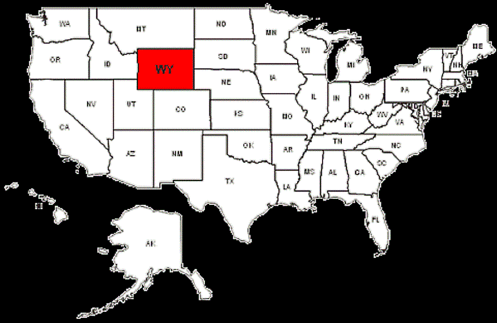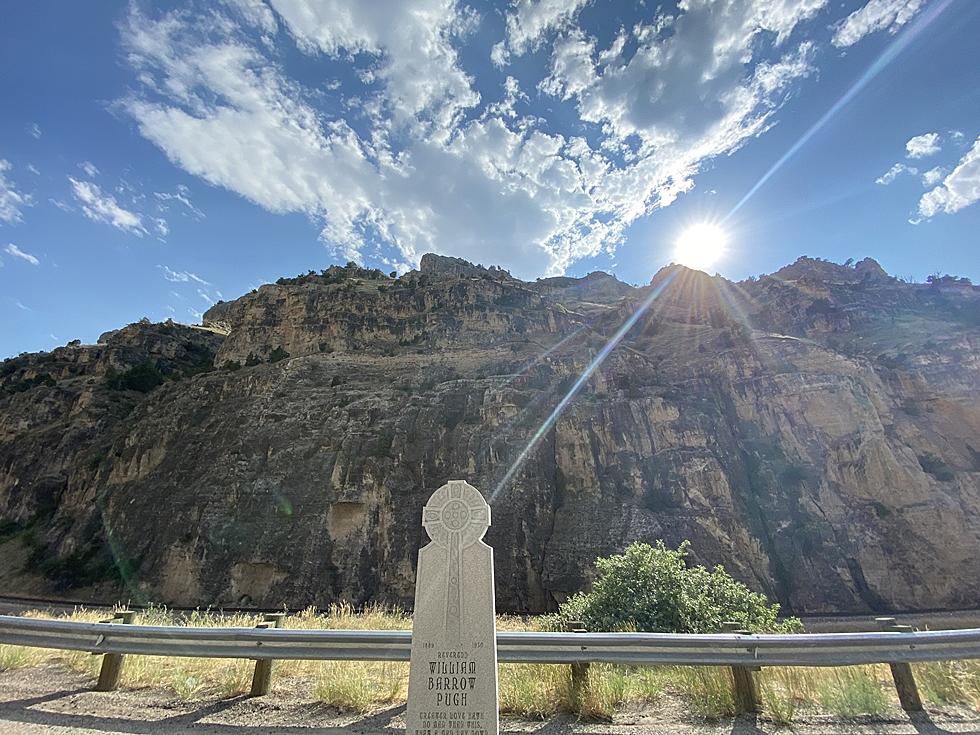
Map Shows How Much the Population Has Changed in Wyo Since 1810
The Internet is all a buzz about this map going around showing just how much the population in each state has changed over the years. More specifically how much has changed since 1810. It's a pretty boring map until you get to somewhere around the 1950s.
[OC] Animation of when land was first developed in the US and construction of the railways from r/dataisbeautiful
As you can see, not a whole lot has changed in our state as far as our population goes. And I'm not really sure as to why not a lot has changed since 1810... I mean we do have oil and I feel that oil alone has made our population boom.
It's still a cool map to take a look at and of course, was found on Reddit. Because where else would you expect to find such an interesting map?

Enter your number to get our free mobile app
More From 104.7 KISS-FM


